Katur Coffee: A Bold Display Font for Modern Web Brands
It started with a hero section that felt… safe. I’d just wrapped up the wireframe for a boutique coffee roaster’s new site—clean layout, strong imagery, thoughtful spacing—but the headline sat there like a polite guest who hadn’t yet said anything memorable. That’s when I dropped in Katur Coffee. Instantly, the energy shifted. Not louder—but bolder, more intentional, like the brand had just leaned in and spoken with confidence.
A Display Font That Anchors Digital Presence
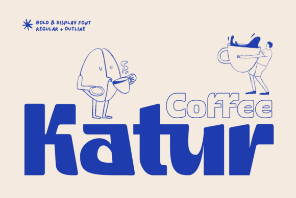
Katur Coffee is a premium sans serif font, but it doesn’t play by quiet minimalist rules. It’s a display font built for impact: geometric, tightly spaced, with sharp corners softened just enough to feel human. What sets it apart isn’t just the clean lines—it’s the optional outline version included in the package. That subtle stroke adds dimension without clutter, making it ideal for layered web graphics, image overlays, or high-contrast banners where legibility and visual weight both matter.
I tested it across three real layouts: a coaching website’s value-prop headline, a small-batch tea brand’s product landing page, and a digital course sales page. In every case, Katur Coffee performed best at hero titles, section headers, and CTA buttons—never body copy, never navigation. Its personality shines brightest when given breathing room and purpose.
How It Behaves on Real Screens
On desktop, Katur Coffee commands attention without shouting. At 48px on a light background with 1.2 line-height, it’s crisp and inviting. Over a muted photo banner? The outline variant holds up beautifully—even at 36px on tablet. But I did notice one thing: on mobile, below 28px, the tight letter-spacing starts to tighten perception—not illegibility, but a slight visual squeeze. So I capped it at 32px for mobile headlines and paired it with generous padding. No compromises, just smart scaling.
For dark mode or low-light UIs, I tested it over charcoal and deep navy. It stayed readable, especially with the solid (non-outline) weight. The geometric forms hold their shape well under contrast, and the even stroke weight avoids pixelation at common web sizes. Just avoid using the outline version on very small buttons—under 16px, the inner negative space begins to close visually, making “O” and “Q” slightly ambiguous for quick scanning.
Where It Elevates—And Where It Doesn’t
Katur Coffee excels in moments that need emotional resonance: welcome messages, brand taglines, limited-edition launch banners, and testimonial highlights. On a portfolio homepage, I used it for the headline “Crafted for Clarity”—and immediately felt the tone align with the designer’s voice. On a course sales page, it framed the core promise (“Build Your First SaaS in 6 Weeks”) with authority and warmth.
But it’s not a workhorse. Don’t use it for:
- Navigation menus or footer links (too decorative for functional text)
- Form labels or input placeholders (lacks the neutrality needed for UX clarity)
- Long paragraphs or blog intros (no italic or light weights included—so no typographic rhythm for extended reading)
- Accessibility-critical interfaces where consistent letterform recognition is non-negotiable (e.g., medical or financial dashboards)
It’s a display font, full stop—and honoring that role makes all the difference.
Smart Pairings for Balanced Digital Typography
What makes Katur Coffee sing online isn’t just its own presence—it’s how gracefully it steps back after taking center stage. I consistently paired it with Inter (a highly legible, open-source sans serif) for body copy, captions, and UI text. The contrast is immediate but harmonious: Katur Coffee brings character; Inter delivers clarity.
For a more editorial feel—say, on a creative studio’s blog—I swapped in IBM Plex Serif for article headings and quotes. The serif’s gentle contrast added sophistication without competing. And for playful accent elements (like “New” badges or seasonal tags), a restrained script—think Playfair Display Italic at 14px—gave just enough flourish without overwhelming.
The key? Let Katur Coffee lead the emotion. Everything else supports.
Practical Notes Before You Implement
Before dropping Katur Coffee into your next project, check what’s included: it ships with .woff2 and .woff files (ideal for web performance), a full set of uppercase/lowercase glyphs, standard punctuation, and basic Latin multilingual support (including accented characters for Spanish, French, and German). No ligatures or stylistic alternates—but that’s by design. This isn’t a variable font, nor does it aim to be. It’s focused, intentional, and ready.
Licensing is straightforward: commercial use is covered, including client sites and SaaS platforms—just verify your license includes web embedding if you’re serving it via CSS @font-face. And always test load performance: because it’s a single-weight display font, it’s lightweight (<25KB compressed), so no noticeable delay in LCP (Largest Contentful Paint).
In short? Katur Coffee isn’t just another creative font. It’s a deliberate tool for designers who understand that typography isn’t decoration—it’s voice, pace, and promise—delivered in pixels.